Parental Clarity
A complete reinvention of Safes from a frustrating parental control app into a calm, trusted digital companion for families. This case study uncovers how deep user research, emotional design, and system-wide restructuring transformed onboarding, device pairing, daily insights, and child–parent interactions—turning a high-churn product into a million-user success. A story of rescuing a struggling app through empathy, clarity, and behavioral design.
Introduction
When I joined Safes as a Senior Product Designer, the company had already launched its parental control app across Google Play and the App Store.
Safes was designed to help parents guide and protect their children’s digital habits — but despite heavy marketing investment, the product wasn’t performing.
The marketing team reported poor campaign results.
Stakeholders were concerned about rising uninstalls and low engagement.
And most importantly, parents — our users — were frustrated and leaving.
I was brought in to diagnose the problem and redesign the product experience.
But instead of jumping straight into Figma, I started with a deeper question:
“Why are users — and even our own team — unhappy with a product meant to bring peace of mind?”
Problem & Research
The Challenge
Safes had two critical issues:
- A misalignment between stakeholder vision and user reality.
- A poor experience that confused both parents and children.
The app had features — lots of them — but the flows were broken, the onboarding was painful, and the architecture made simple actions unnecessarily complex.
Despite an expensive marketing push, parents were uninstalling the app almost immediately.
Research & Discovery
I requested time from stakeholders to perform a complete UX audit before touching a single screen.
My research included:
- Reviewing support tickets and customer complaints.
- Analyzing user data from analytics tools.
- Conducting interviews with parents in multiple countries.
- Speaking with support, marketing, and QA teams.
- Observing live usability sessions with real parents installing the app.
The results were both revealing and alarming:
- High uninstall rate: Many parents removed the app within minutes of installation.
- Broken pairing flow: Parents struggled to install the child app on their child’s device — the process took up to 30 minutes or more.
- Wrong investment direction: The team had built a web panel that few users used; 90% preferred mobile.
- Inconsistent design & poor UX: Flows lacked clarity, and there was no proper design system.
- Unreliable functionality: Some key features simply didn’t work as expected.
In short: the app created frustration instead of reassurance.
Design Strategy
After presenting my findings to stakeholders, I proposed a new direction:
- Redesign the product from the ground up.
The existing IA and flows were too broken to patch. - Discontinue the web panel and focus on optimizing the mobile apps.
- Adopt a research–test–iterate loop for every major design decision.
- Rebuild the design system to help developers deliver faster and consistently.
- Humanize the experience through storytelling and gamification, reducing children’s resistance to monitoring apps.
Stakeholders agreed — and Safes’ redesign journey began.
Understanding the Users
I defined two primary personas:
- Parent (Primary User) that monitor, guide, and protect their child’s device use and their pain points were overwhelmed by complexity, limited time, frustration with tech setup.
- Child (Secondary User) that use devices safely without feeling controlled and their pain points were dislikes parental apps, perceives them as restrictive or invasive.
From these, I mapped user journeys for both Parent and Child apps — focusing on empathy, control, and simplicity.
Redesigning the Experience
Simplifying the Onboarding Flow
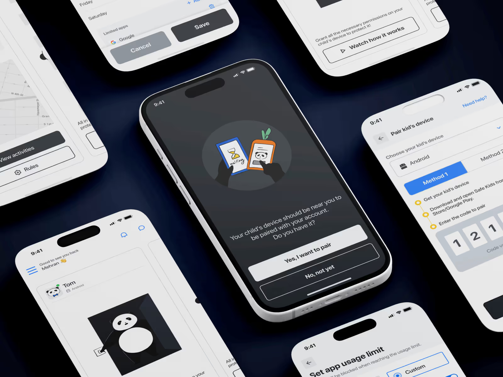
The pairing process between the parent and child device was the biggest friction point.
Parents struggled with technical steps, unclear language, and a lack of guidance.
I designed and tested multiple onboarding prototypes until I arrived at a flow that felt effortless:
- Welcome & Readiness Check
→ “Is your child’s device near you?” - Pairing Flow
→ Parents follow step-by-step illustrated instructions or watch a short video tutorial. - Built-in Age Settings
→ Once paired, Safes recommends ready-made settings based on the child’s age group (editable later). - Activation Confirmation
→ The app hides all advanced features until pairing completes, keeping focus on a single task.
This small change cut onboarding time by more than half in prototype testing.
Making Features Understandable
Parents often don’t have the time or patience to dig through data-heavy dashboards.
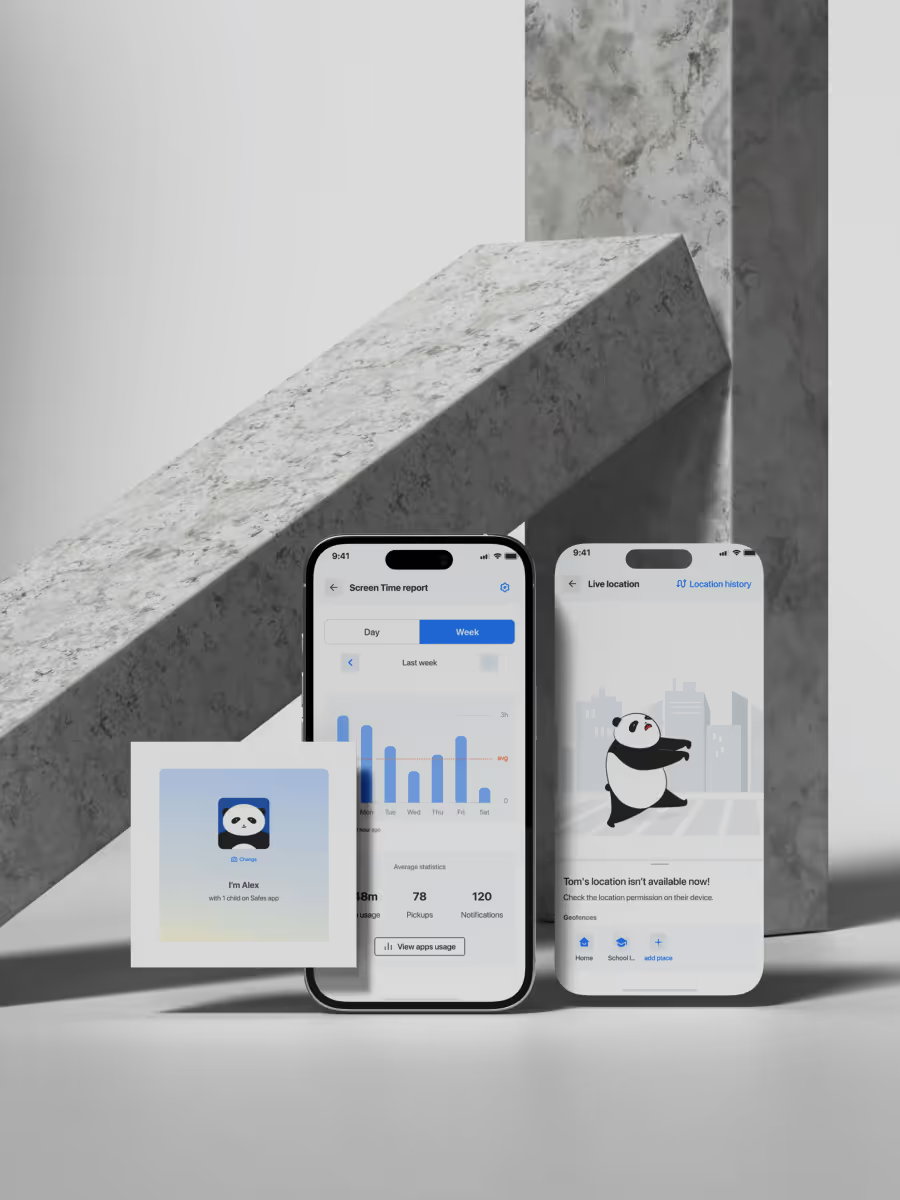
I redesigned key features to show what matters at a glance — focusing on insights, not interfaces.
Each parent’s dashboard now displays:
- Child’s screen time and app usage trends.
- Most used apps, searched keywords, and visited websites.
- Alerts only when attention is needed (“Your child used TikTok 2 hours above limit today”).
This allowed busy parents to feel informed without being overwhelmed.
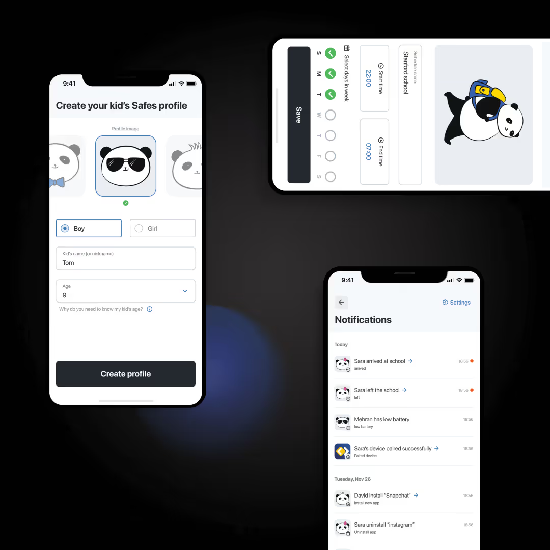
App Rules & Controls
The App Rules feature was redesigned from a technical interface into a guided flow:
- Parents can set daily time limits per app,
- Allow or block certain apps, or
- Restrict usage during school hours using ready-made time templates.
The UI emphasizes simple language and real-time feedback — “You’ve limited YouTube to 1 hour per day.”
Web Filter & Safe Search
We overhauled the Web Filter experience with pre-categorized filters powered by an in-house database of thousands of keywords and domains — organized by child age group.
Parents can easily:
- Toggle safe content categories,
- Add custom sites or keywords,
- Enable Safe Search and YouTube restriction modes.
What was once a tedious configuration became a 3-step guided process.
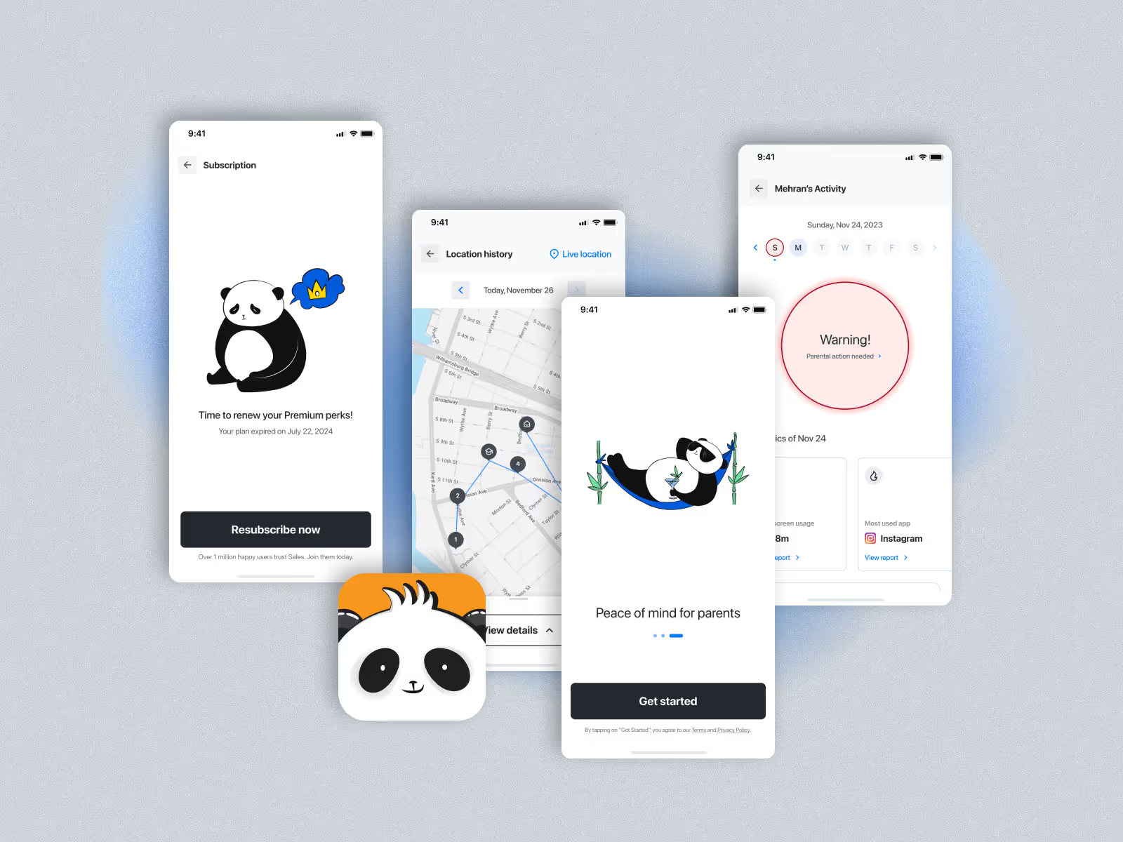
Bringing Joy: Gamification & Storytelling
Most children naturally resist parental control apps — they perceive them as punishment tools.
To change that narrative, I introduced a mascot and storytelling space inside the child app.
We created Panda, a friendly character who helps children understand safety and digital balance.
This was done in close collaboration with our in-house illustrator, creating a cohesive visual identity and emotional layer.
The Panda appears in daily summaries, tips, and activity milestones — turning digital limits into small, rewarding lessons.
This decision transformed Safes from a surveillance app into a digital wellbeing companion.
Design System & Testing
Safes previously lacked any consistent design system.
Developers were recreating components manually, leading to inconsistency and bugs.
I built a new design system from scratch — covering color, typography, iconography, spacing, and component states — optimized for both Android and iOS.
This became the foundation for rapid iteration and ensured visual harmony across features.
Before implementation, I created a high-fidelity interactive prototype and conducted extensive remote usability testsusing Maze.
We tested real-world tasks with parents from the U.S., U.K., and Germany.
Participants completed flows such as:
- Pairing devices,
- Setting screen time limits,
- Filtering websites, and
- Reading daily activity summaries.
Results:
- 94% completed key tasks successfully.
- 87% described the experience as “easy” or “pleasant.”
- 90% said they would recommend the app to other parents.
The feedback validated our design direction and uncovered minor text and icon improvements, which were promptly iterated before development.
Launch & Results
After successful testing, the engineering team implemented the new Safes apps for Android and iOS.
We relaunched through marketing campaigns via WebEngage, encouraging old users to migrate with coupons and new onboarding guides.
Results after launch:
- Uninstall rate dropped dramatically.
- Pairing success rate increased by more than 70%.
- User satisfaction improved across app store reviews.
- Safes surpassed 1 million active users, maintaining strong engagement metrics.
Safes went from being a disappointing investment to a trusted digital parenting solution.
Reflection
Safes was one of the most challenging and rewarding projects of my career.
I joined alone as the only designer, inheriting a product with low trust, poor UX, and unclear vision — and helped turn it into a beloved app used by families around the world.
This project taught me that design’s greatest value often lies in empathy and persistence — not pixels.
“You can’t fix usability without understanding emotion.
And you can’t earn trust without earning simplicity.”