Healthcare Platform
A multi-year transformation of Iran’s largest digital healthcare platform—reshaping a broken, distrustful appointment system into a fast, human, mobile-first experience that millions could rely on. This case study explores how research, behavioral insight, and system redesign turned a fragile product into a trusted healthcare gateway. A platform rebuilt around clarity, assurance, and the quiet confidence patients need when choosing care.
The Starting Point
When I joined Darmankade, Iran’s first large-scale doctor booking platform, the vision was bold:
“Digitize the entire healthcare journey — from booking to consultation — and make it accessible to everyone.”
The reality was less inspiring.
Patients didn’t trust online healthcare.
Doctors and their secretaries resisted change.
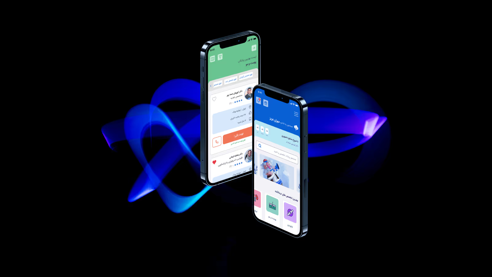
And the core platform — the website — was slow, fragmented, and poorly optimized for mobile, even though 70% of traffic came from phones.
I joined as the only designer, tasked with fixing not just the interface, but the experience of trust.
The Challenge
In Iran, healthcare is deeply personal. Patients prefer calling clinics directly, and doctors value face-to-face contact.
We weren’t just improving UX — we were asking users to trust a new behavior.
To succeed, the platform had to be fast, human, and reliable — every interaction needed to feel like a professional promise kept.
Research & Insights
I led mixed-method research combining data, usability, and field insight:
- Hotjar session recordings revealed high drop-off on booking and payment steps.
- Usability tests with real patients uncovered confusion in calendar and scheduling flows.
- Interviews with doctors and secretaries exposed operational bottlenecks.
- Support team shadowing surfaced the human cost of system flaws.
Key Findings
- Mobile UX was broken.
Non-responsive design frustrated users; most gave up mid-booking. - Booking flow was unclear.
Calendar logic, date formats, and payment confirmation all caused abandonment. - Secretaries ignored online appointments.
Without digital literacy or incentives, many defaulted to old methods. - No feedback loops.
Users didn’t receive confirmation or assurance — feeding distrust.
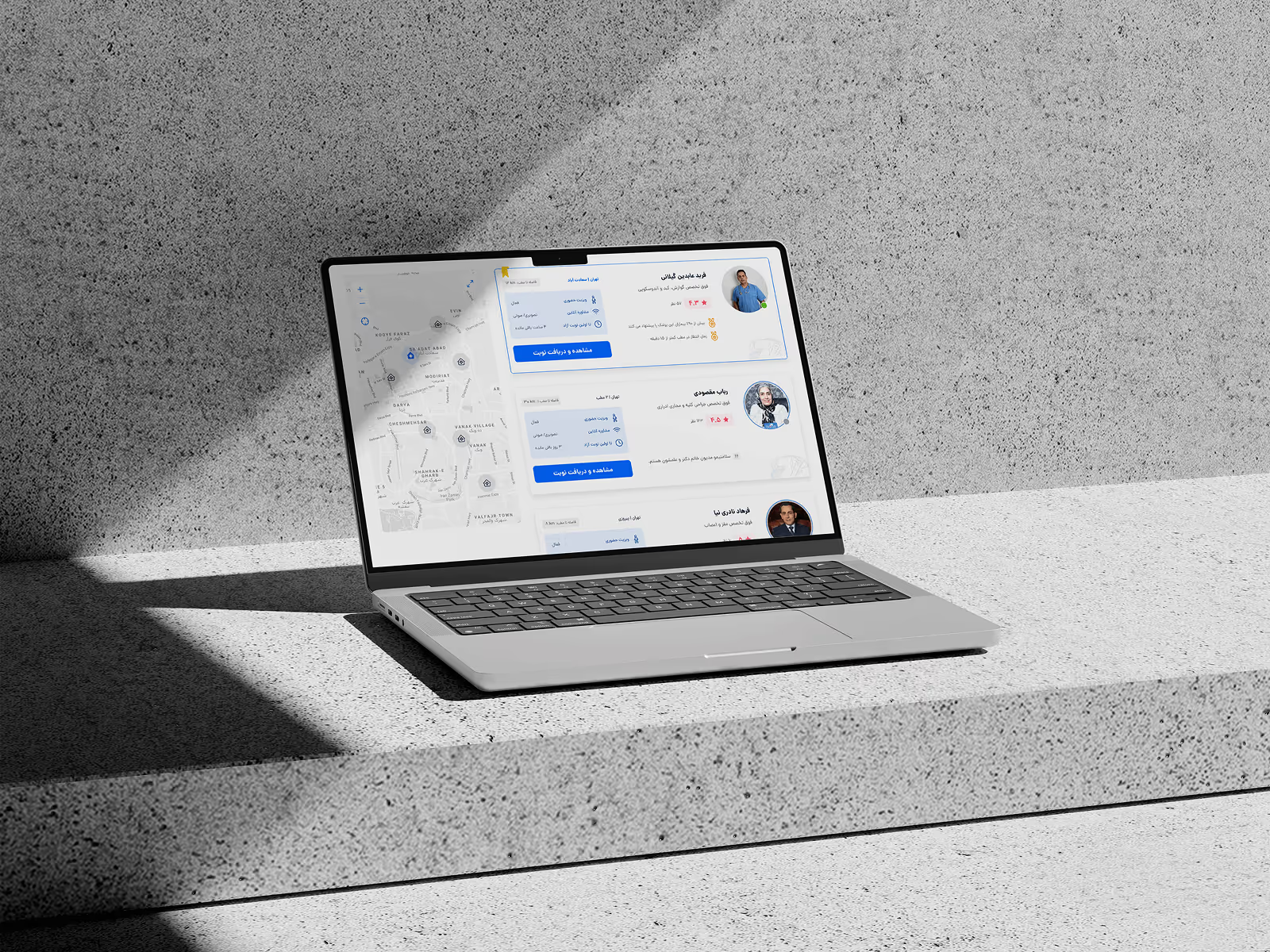
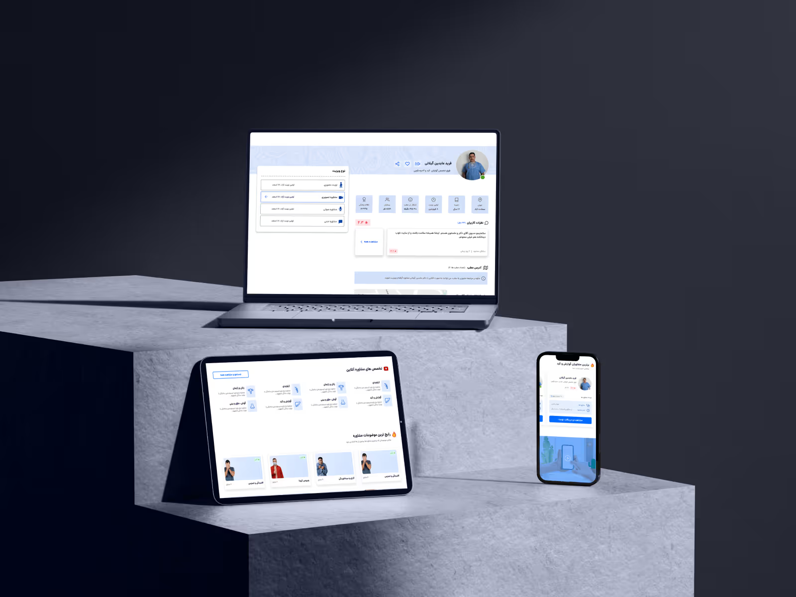
Solution — Redesigning for Simplicity and Confidence
The first step was to rebuild the booking experience from the ground up.
Design Actions
- Introduced a mobile-first responsive layout.
- Tested and finalized a simplified calendar system (from five prototypes).
- Reduced checkout steps from 5 → 3 with clear progress feedback.
- Introduced microcopy that sounded human, not technical.
- Built a UI kit to ensure cross-page consistency.
Impact
Within months:
- Daily successful bookings grew from ~10 to 200+ per day.
- Drop-offs in booking flow decreased significantly.
- Support tickets for “failed reservations” dropped sharply.
The redesign became the foundation for everything that followed — apps, online consultation, and AI-driven tools.
Reflection
This phase taught me that in healthcare, usability isn’t enough.
People only trust what they can understand — and what works the first time.
The redesigned platform became more than a booking tool; it became a digital handshake between patient and doctor.
Ecosystem Impact Summary
- Online bookings grew 20× (10/day → 200+/day).
- Secretary participation rate rose sharply through gamification.
- Online consultation opened new revenue streams.
- AI-driven symptom checker increased engagement and credibility.
- Unified design system enabled scalability across all touchpoints.
Even years later, Darmankade’s products remain widely used — a testament to strong user insight, systemic thinking, and the power of designing for trust.