Retail Clarity
Designing Himart: Empowering Local Businesses Through SimplicityA ground-up redesign of Himart’s seller experience—transforming a complex FMCG retail tool into a simple, trustworthy companion for small shop owners across Iran. This case study explores how field research, real-world usability testing, and a new visual language helped thousands of corner stores understand discounts, navigate promotions, and buy smarter. A story of turning confusion into confidence for the people who power the country’s everyday commerce.
Context — Modernizing Iran’s Corner Shops
In Iran’s rapidly changing retail economy, small supermarkets were quietly losing ground. National chains and digital commerce were capturing market share, leaving thousands of neighborhood stores struggling to keep up with pricing, promotions, and supply networks.
Himart, a member of the Tabiat Mihan Industrial Group, set out to reverse that trend. The company built a digital ecosystem to help local shop owners modernize — offering tools for in-store sales, supplier discounts, and data-driven purchasing. By connecting 2,500+ stores with distributors and manufacturers, Himart aimed to create a national retail network powered by technology instead of crushed by it.
When I joined the team as a Product Designer, the company already had a seller app on the market.
On paper, it was everything store owners needed.
In reality, it was everything they didn’t understand.
Sellers complained that discounts were unclear, promotions were confusing, and navigation felt like “a maze.” Each second of friction cost a potential sale. My goal was simple but ambitious: rebuild the experience around clarity, trust, and speed.
Understanding the Challenge, From Technical Tool to Human Tool
The seller app was meant to be the beating heart of Himart’s platform — where local retailers could:
- Order discounted products
- Join promotional festivals
- Track sales performance
- Communicate with suppliers
But engagement told a different story. Adoption was low, uninstall rates were high, and support lines were busy with confused users.
Even experienced sellers who’d been using digital systems elsewhere found Himart’s logic “too complicated to bother with.”
What We Were Up Against
- User-level problem: Sellers couldn’t easily understand discounts or track profits — the most critical information for their business.
- Business-level problem: Low app usage hurt revenue and strained support resources.
- Market-level problem: Competitors like DigiCollaget and SnapSupply were faster and simpler.
Our challenge wasn’t to add features.
It was to rebuild comprehension — to make the system feel like an assistant, not a puzzle.
Research & Insights — Designing in the Real World
Rather than running tests in the office, I went to where our users actually worked: the small supermarkets and corner stores that powered Himart’s ecosystem.
I spent several weeks interviewing:
- Shop owners and cashiers in Tehran and nearby towns,
- Sales representatives from Himart’s distribution network, and
- Marketing and operations teams managing discount campaigns.
I complemented these visits with usability sessions in the office (observing 3 active sellers using the app), Hotjar analytics to track interaction bottlenecks, and focus groups with the sales team to interpret behavioral patterns.
Key Insights
1. Discounts were invisible — and trust depended on them.
Sellers are deeply profit-margin–oriented. They live on small percentage gains, so every hidden discount or unclear rule directly affects their livelihood.
Yet in our app, five different discount types (commodity, special sale, tiered, high-volume, and card-based) looked identical. Users had no idea what applied when — or why.
“If I don’t see how I’m earning, I stop buying,” one shopkeeper said.
2. The hierarchy was upside-down.
The dashboard mixed analytics, banners, and text-heavy campaigns. Instead of guiding users toward immediate deals, it forced them to interpret marketing logic. It was designed for the company, not the cashier.
3. Competing apps set a higher bar.
Other FMCG networks offered faster load times, fewer taps, and clearer pricing — making our users question Himart’s reliability.
4. High cognitive load was killing engagement.
Most shopkeepers weren’t tech-savvy. They didn’t read long tooltips or onboarding guides; they learned by doing. Our app didn’t teach through doing — it punished mistakes.
Synthesis
These insights made the problem clear:
To help small businesses thrive, we didn’t need “smarter” features — we needed a simpler language of commerce.
Our design mission became:
Turn complex promotional logic into everyday understanding.
Design Strategy — Clarity, Trust, and Reward
Our design strategy revolved around a single premise:
If sellers could instantly understand what a discount meant, they’d trust the platform — and that trust would turn into sales.
We translated this into three design principles that guided every decision:
- Simplify everything — structure discounts, navigation, and visuals around how real shopkeepers think.
- Build trust through transparency — show why and when a discount applies, not just the final number.
- Make progress feel rewarding — use visual cues and micro-interactions to reinforce smart purchasing behavior.
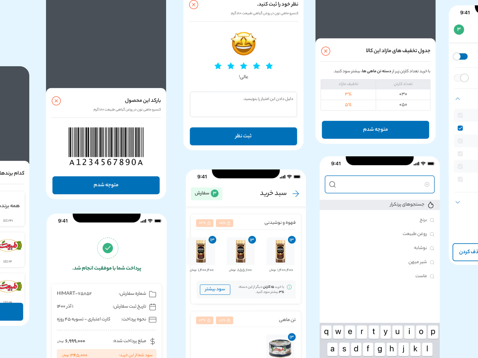
Simplifying Discounts & Promotions
The heart of the problem was cognitive overload. Discounts appeared in multiple formats with no consistent meaning.
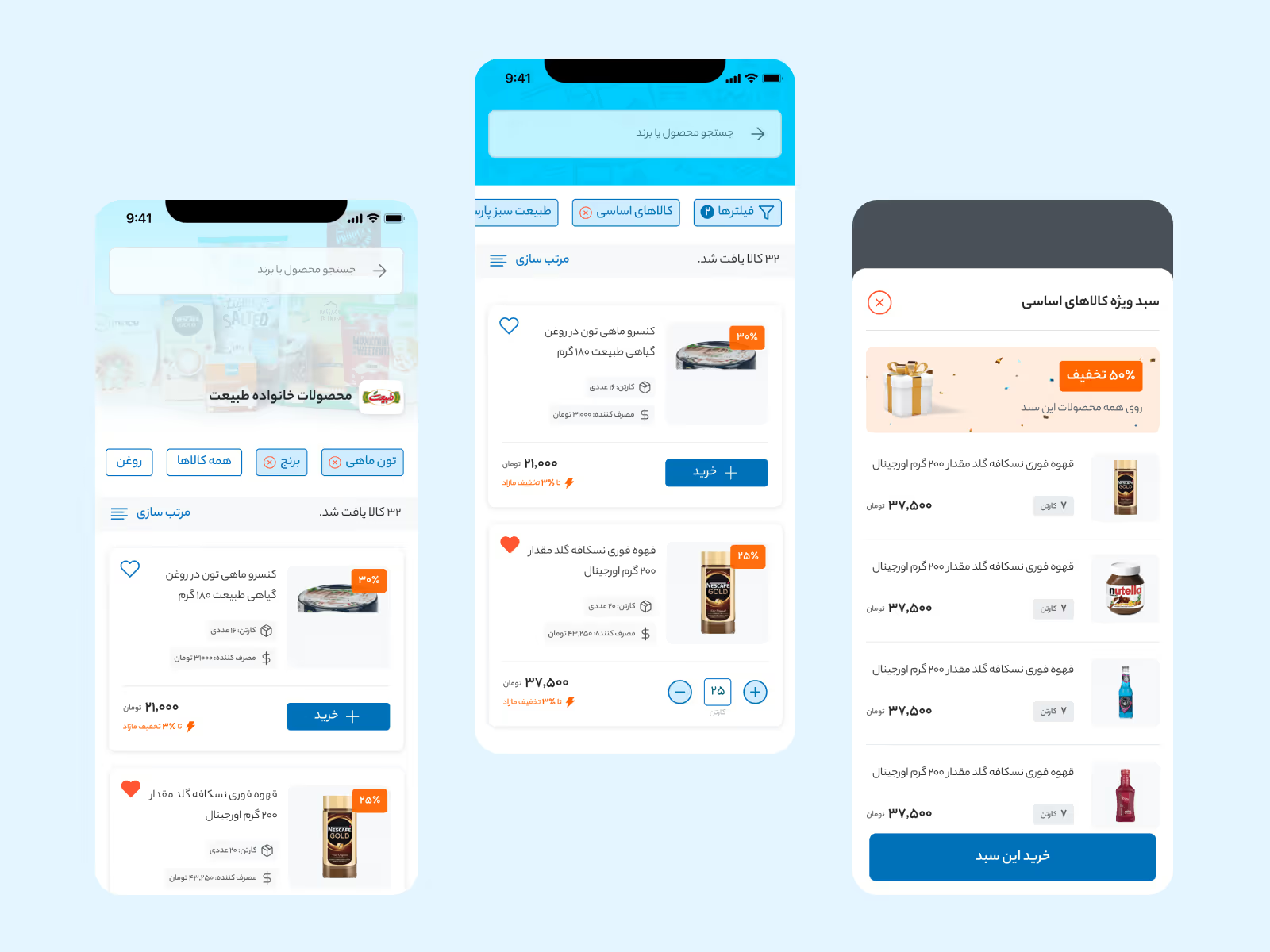
We introduced a visual discount language — a system of clear, color-coded and icon-based tags that could be recognized at a glance:
- 🟡 Gold label – Time-limited Festival Offer
- 🔵 Blue label – Supplier discount
- 🟢 Green label – Bulk-purchase deal
Each tag came with a short, friendly tooltip in plain Persian (e.g., “Buy 3, get 15% off — ends in 2 days”).
This change turned invisible math into visible opportunity.
During testing, sellers began prioritizing deals naturally — without reading manuals or calling support.
Restructuring the Information Architecture
The previous app buried key actions behind deep menus and overloaded dashboards. We reorganized the entire structure based on the seller’s mental model of a working day:
- Today’s Offers — quick access to new discounts.
- My Orders — purchase history and tracking.
- Festivals & Campaigns — time-limited promotions.
- Market Insights — analytics for advanced users.
This flow mirrored how shopkeepers think:
“What’s new?” → “What did I buy?” → “What can I sell more of?”
It turned navigation from a system map into a story of daily commerce.
A New Design System for Consistency
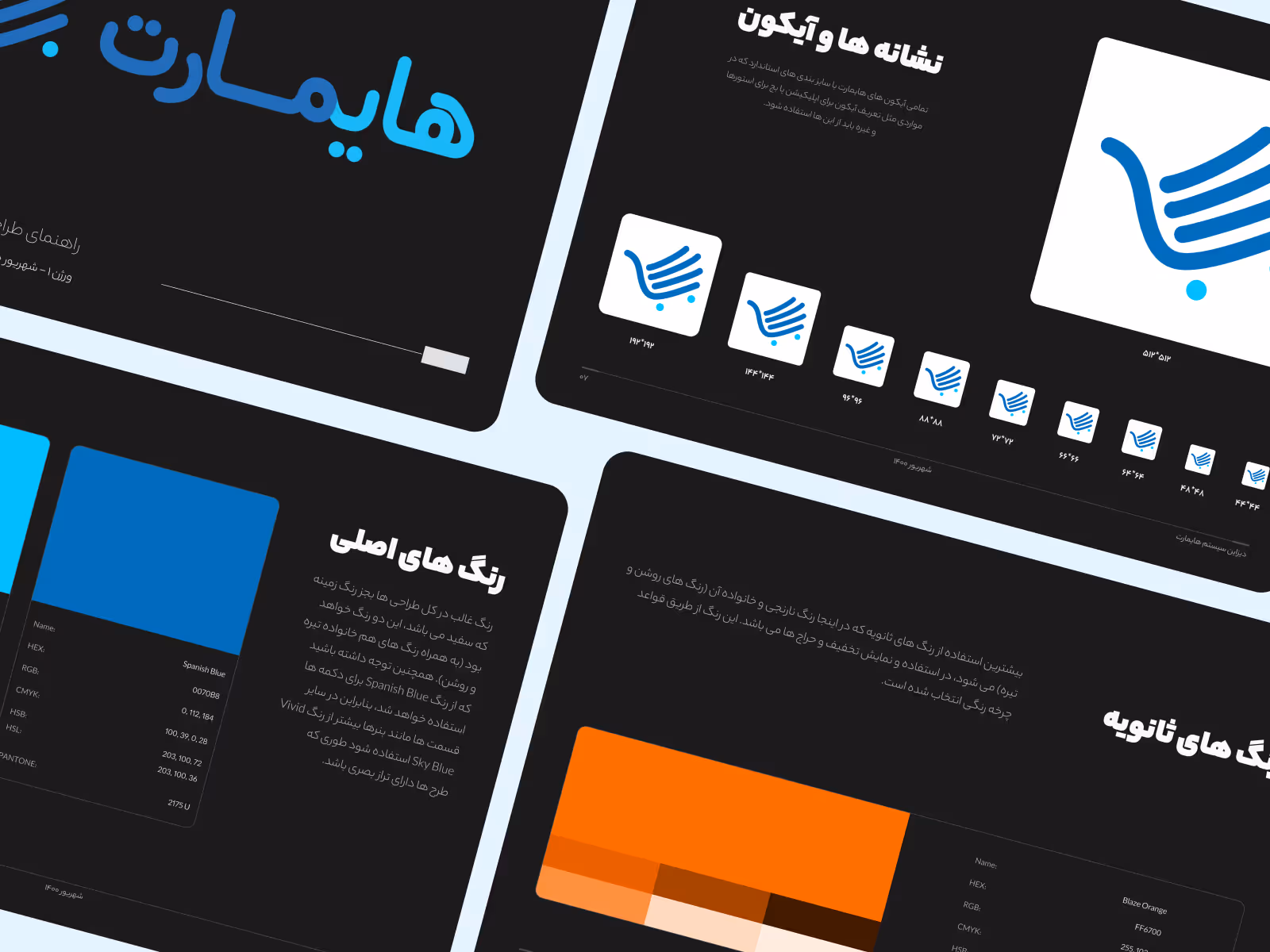
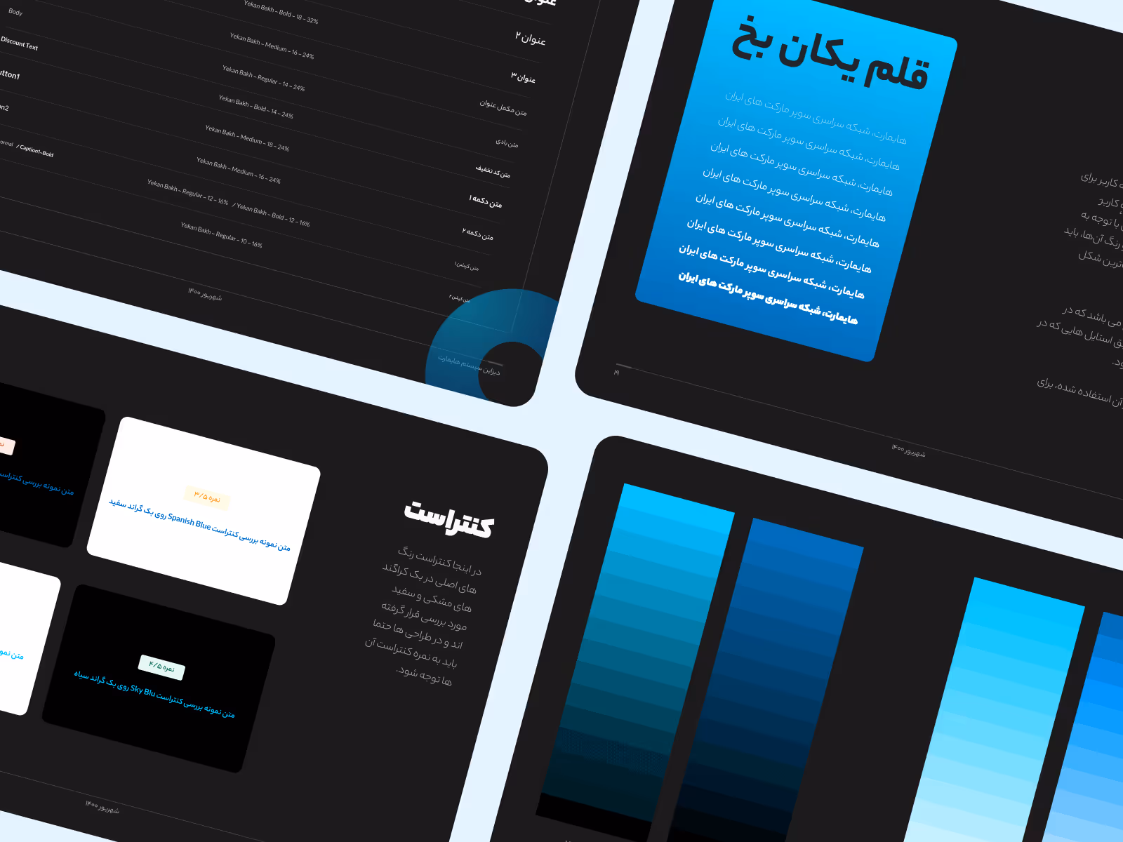
Each release before my arrival looked like a different app. Colors, fonts, and components changed from one version to another — eroding trust.
I built a modular design system in Figma, establishing reusable components for cards, banners, forms, and badges. The palette balanced neutral greys with red and green accents derived from Himart’s brand, striking a professional yet approachable tone.
Beyond UI consistency, the system became a shared visual language for designers, marketers, and engineers. It allowed rapid iteration while keeping a coherent visual identity — a foundation later reused for Himart’s B2B dashboards.
Testing in Real Environments
We avoided lab testing entirely. Instead, I sat beside cashiers in actual supermarkets — observing them use interactive prototypes between customers.
We tested:
- Deal comprehension (A/B visual layouts)
- Task time (placing an order with a discount)
- Satisfaction (short verbal ratings after use)
The outcome was decisive:
- 90% of participants completed the main task without help
- Average order placement time dropped by nearly half
- The most common feedback: “It’s simple now — I don’t need to think.”
Results — Simplicity That Sold
The redesigned Himart app was rolled out gradually across the retail network. Within weeks, adoption and engagement began to rise noticeably.
Key outcomes:
- Discount comprehension skyrocketed.
Before redesign, sellers frequently called support to understand discount types. After the redesign, 9 out of 10 users could identify and apply discounts correctly without help. - Order completion increased by nearly 30%.
Simplified navigation and clearer deal presentation reduced friction during purchase, directly boosting order volume and repeat sales. - Support calls dropped dramatically.
The sales and customer service teams reported a major decline in “how to use” inquiries, freeing them to focus on onboarding new partners instead of troubleshooting confusion. - User sentiment transformed.
In post-launch surveys, sellers described the new app as “simple,” “comfortable,” and “fast.” Sales reps noticed a new trend — shop owners were teaching each other how to use the app.
One store owner summed it up perfectly:
“This version feels like it’s made for us. The others make me feel lost.”
The metrics proved the redesign worked. The emotional reactions proved it mattered.
Reflection — When Clarity Becomes Competitive Advantage
Himart taught me that good design isn’t always about sophistication. In environments where users are busy, pragmatic, and profit-driven, the most valuable design quality is clarity.
By focusing on how small retailers think, we turned a confusing technical product into a reliable business companion — one that helped sustain local shops in a market dominated by giants.
Months after launch, I revisited one of our pilot stores. The owner still used the app every morning to check offers. He didn’t remember my name — but he remembered the feeling.
“This one works,” he said. “The others confuse me.”
That’s the quiet kind of validation that matters most.
Because design success isn’t when users admire your interface —
it’s when they stop noticing it altogether, and just get back to their work.