Guided School Drive
A focused, safety-driven redesign of school transportation workflows—turning a once-complex process into an effortless, glanceable mobile experience. This case study reveals how designing for motion, cognitive load, and real-world constraints led to an app that drivers can use instinctively and parents can trust fully. A minimal interface built for maximum clarity on the road.
Introduction
When I was asked to design a Driver App for school transportation, I knew it had to be different from any other app I had worked on.
This wasn’t a productivity tool or an MDM dashboard — it was an app used while driving, often by people who weren’t tech-savvy and who needed to focus on the road, not the screen.
The goal was simple but critical:
Build a light, reliable, and easy-to-use app that helps school drivers safely pick up and drop off students, while keeping parents informed in real time.
The challenge was to design for two realities — the driver’s safety and simplicity, and the parent’s need for visibility and reassurance.
Problem & Research
The Challenge
The core design question was:
“How can we make an app simple enough for drivers, yet smart enough to reassure parents?”
Key considerations emerged quickly:
- Drivers often work early mornings and evenings — visibility and accessibility are crucial.
- Parents expect real-time tracking and status updates of their children.
- Drivers need clear navigation without distractions or complex interactions.
Research Process
Before starting any wireframes, I conducted short interviews with:
- School transport coordinators,
- Drivers from partner schools, and
- Parents already using our Safes parental control ecosystem.
We learned:
- Drivers prefer large, tactile buttons and minimum text.
- Most rely on Android devices mounted in vehicles.
- They don’t want to “manage apps” — they just want to “press Start and drive.”
- Parents mainly care about live updates, not micro-details of the route.
These insights shaped our guiding principles:
- Zero complexity while driving
- Hands-light, glanceable interface
- Automatic updates for parents — no manual sharing
Design Strategy
Defining the Experience
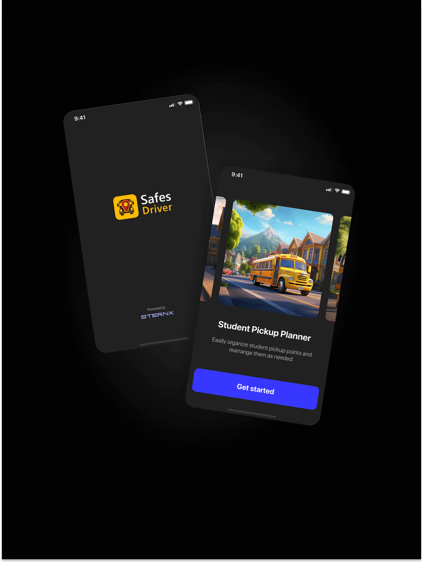
Each driver’s day starts with a simple task plan: Pick Up or Drop Off.
No endless menus, no dashboards — just a focused flow designed for clarity and motion.
Pick-Up Flow
- Driver logs in → “Today’s Plan” appears.
- If scheduled for a route, they see two large options: Pick Up or Drop Off.
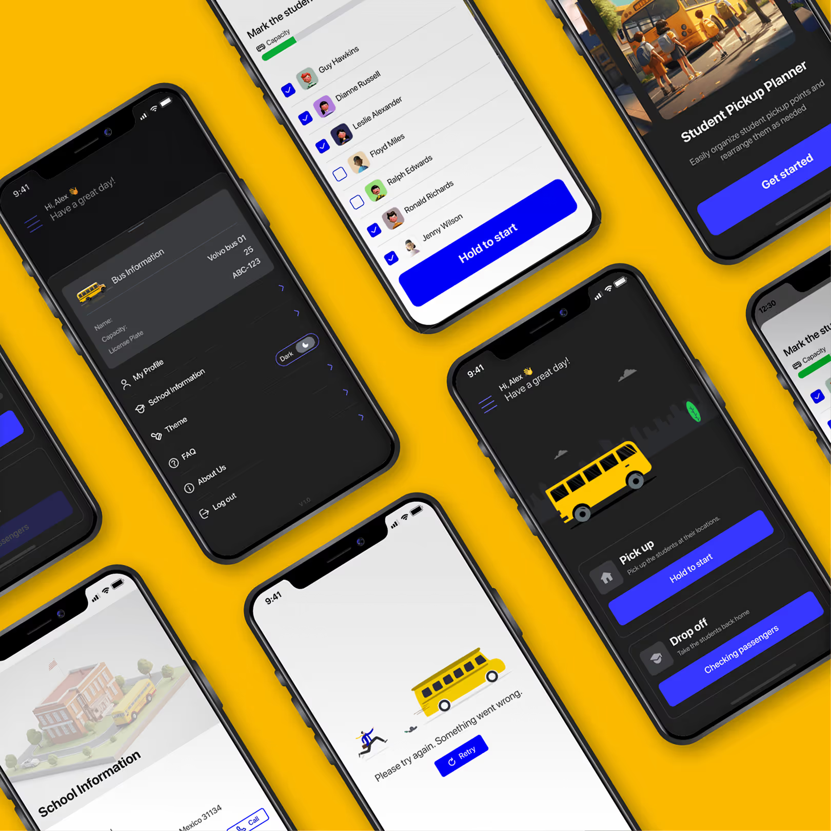
- Selecting Pick Up opens a list of assigned students.
- The app suggests the optimal route based on GPS, but the driver can reorder stops if needed.
- For each student:
- Tap Picked Up to confirm.
- If absent, mark Absent before moving on.
- Once all statuses are confirmed, the app automatically tracks the drive to school.
Drop-Off Flow
The afternoon flow mirrors the morning, but in reverse — from school to each child’s drop-off location, confirming arrival for every stop.
Making It Human
Even though the interface was simple, I wanted the app to feel friendly, not mechanical.
I designed micro-interactions and subtle motion feedback when drivers complete actions — confirming a pickup, finishing a route, or receiving a message from a parent.
Color design focused on accessibility under real driving conditions:
- High-contrast modes for sunlight.
- “Night mode” with dimmed tones to reduce glare.
- Large, rounded touch targets to prevent mistaps.
The tone of UI copy was conversational and calm:
“All students picked up. Great job!”
This small layer of empathy made the interface feel supportive rather than transactional.
System Integration
The Driver App was also integrated with the Safes Parental Control ecosystem:
- Parents could see live location updates from the driver’s route inside their own app.
- In-app messaging allowed parents to communicate with the driver directly (for example, to inform absence or schedule changes).
- Each route synced automatically with student geofences — if a child exited a zone unexpectedly, parents were notified instantly.
This connection made the driver app part of a larger ecosystem of trust.
Design System & Testing
I created a dedicated UI kit for the driver app — lightweight, clean, and consistent with the Safes visual language but optimized for driving environments.
Elements included:
- Large, adaptive buttons
- Location-based cards
- State icons for pickup, absence, and completion
- Custom navigation visuals for route guidance
Once the prototype was ready, we conducted field testing with real drivers from our partner schools.
We watched how they interacted with the app while stationary, during route simulation, and at rest stops.
Testing outcomes:
- All participants completed daily tasks without guidance.
- Most described the app as “simple” and “relaxing.”
- No major usability issues were reported.
After validation, we finalized the Android build and later began adapting the design for iOS.
Outcome
The Driver App launched successfully on Android and quickly became an essential part of school transport operations.
Key outcomes:
- Drivers completed routes faster with fewer input errors.
- Parents gained real-time visibility of their children’s commute through the Safes ecosystem.
- Schools reported fewer missed pickups and better communication between staff and families.
The app also set a new internal benchmark for designing “zero-friction tools” — apps that work invisibly, enabling users to focus on their real-world tasks.
Reflection
This project reminded me that simplicity is often the hardest design challenge of all.
Designing for drivers wasn’t about visual delight — it was about clarity under motion, trust under pressure, and effortless usability.
The success of the Driver App came not from adding features, but from removing friction.
It’s one of those rare projects where design quietly fades into the background — letting people do their jobs better, safer, and with confidence.
“Good design for the road isn’t about screens.
It’s about keeping eyes on what matters most.”