Tooskaflower
Designing a warm, fast, and trustworthy e-commerce experience for Tooskaflower — making emotional purchases like gifting bouquets simple, clear, and delightful.
Context — When Beautiful Flowers Meet a Not-So-Beautiful Shopping Experience
Tooskaflower had earned customer love offline — their bouquets were thoughtful, modern, and crafted with care.
But digitally, the story didn’t match.
Their online store felt disconnected from their brand quality.
Customers struggled to find the right bouquet, compare options, or trust delivery timelines — especially for urgent, emotional purchases like birthdays, apologies, condolences, and same-day surprises.
The consequences were clear:
- High cart abandonment
- Confusion around delivery time and freshness
- Slow navigation on mobile
- Customers calling instead of ordering
- A digital experience that didn’t reflect the care of the product
In flower gifting, hesitation kills conversions.
If a customer loses confidence at any point, they leave — and buy from another florist who promises clarity faster.
Our mission became clear:
Design an online experience that feels as warm and thoughtful as receiving flowers — while making buying incredibly simple.
Understanding the Challenge — Buying Flowers Is Emotional, Not Logical
Through early customer interviews and a review of support logs, I discovered three primary buyer types:
- Gift-givers needing fast choices and confidence
- Occasional buyers unsure what to pick
- Last-minute shoppers needing clear delivery promises
But one insight stood out:
People don’t buy flowers — they buy emotions.
They buy a feeling, a gesture, a message.
And the existing UX didn’t support that.
Products were listed like generic SKUs, not meaningful gifts.
To improve conversions, we needed to design not just a shop — but a guided emotional journey.
Research & Insights — Studying Behaviors Behind “Add to Cart”
My research focused on three areas:
1. Customer behavior review
Support logs and chat data revealed:
- Customers constantly asked about delivery time
- Many buyers didn’t know which bouquet size to choose
- Add-ons (like vases or message cards) were rarely discovered
This wasn’t a conversion problem — it was an information clarity problem.
2. Competitor teardown
Top-performing floral shops used:
- Immediate emotional photography
- Fast selection workflows
- Clear delivery expectations
- Mobile-first UX patterns
Tooskaflower lacked each of these elements.
3. Field interviews
Speaking with customers revealed a key insight:
They wanted the buying experience to feel as thoughtful as the flowers themselves.
This gave us our direction:
emotion + clarity + simplicity.
Design Strategy — Emotion First, Friction Never
The design strategy revolved around three pillars:
1. Lead with emotion
Flowers communicate feelings. Photography and layout had to do the same.
2. Guide the choice
Most users don’t know what size or arrangement fits the moment.
We needed smart defaults, clear comparisons, and simplified decision-making.
3. Make trust visible
Delivery expectations, freshness guarantees, and checkout transparency had to be unmistakably clear.
We set the goal to make ordering flowers feel like a natural human gesture — not a logistical puzzle.
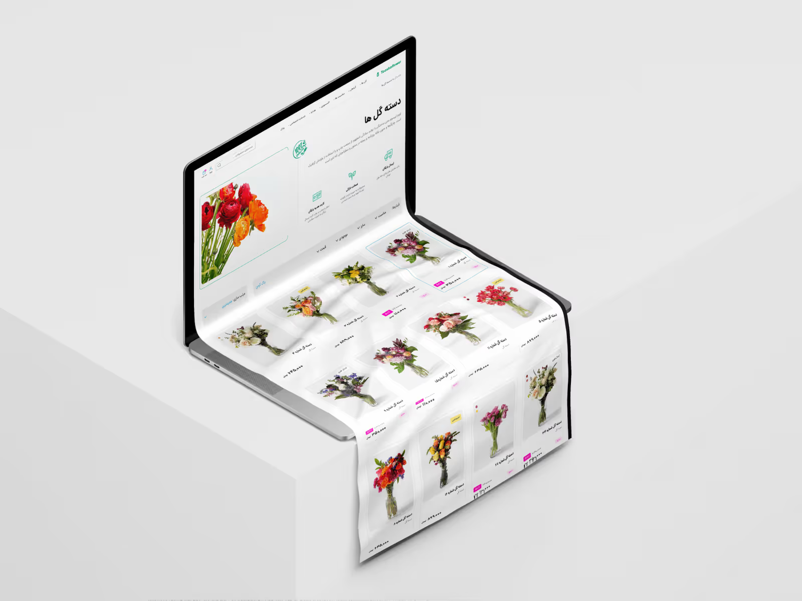
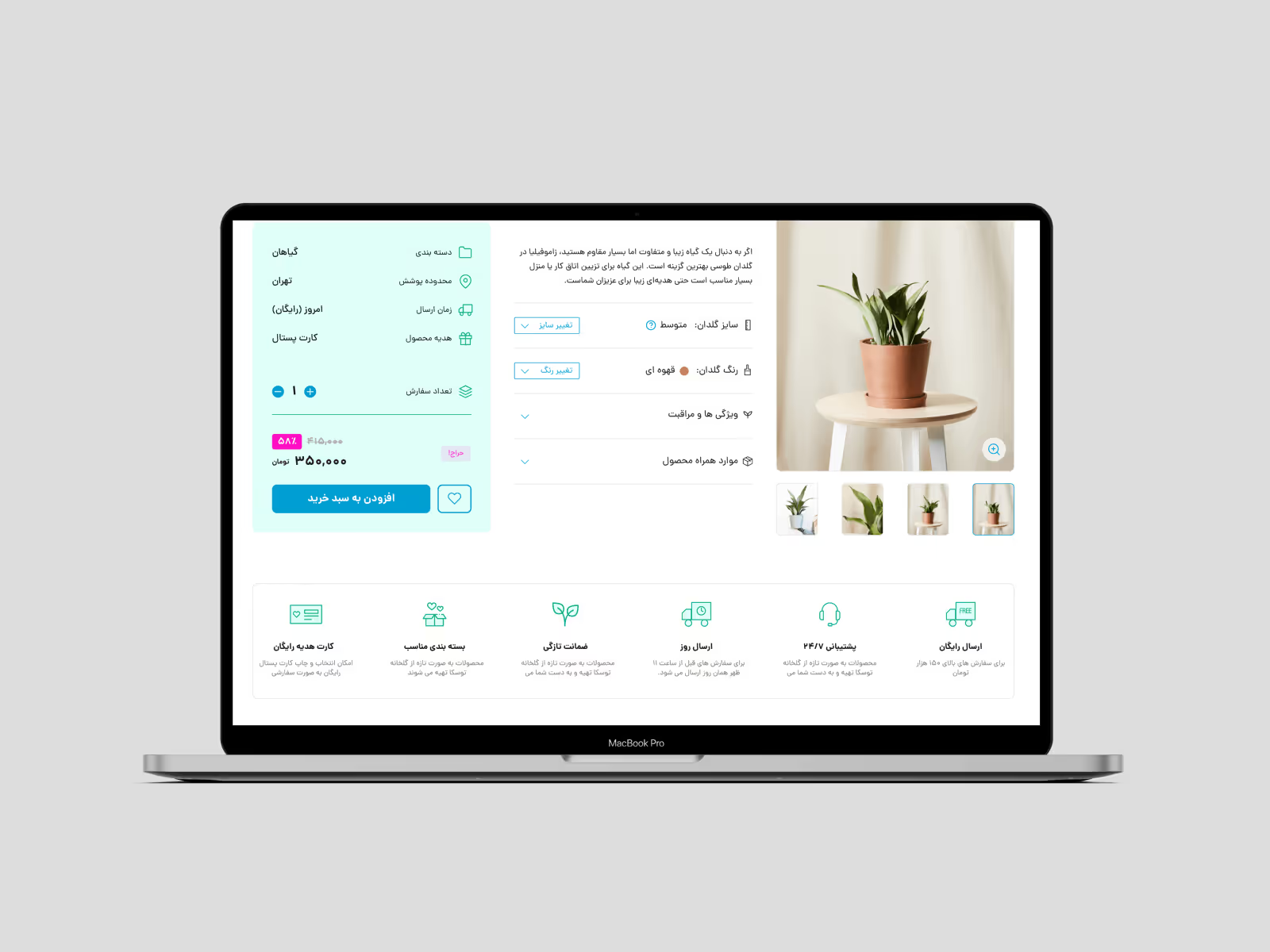
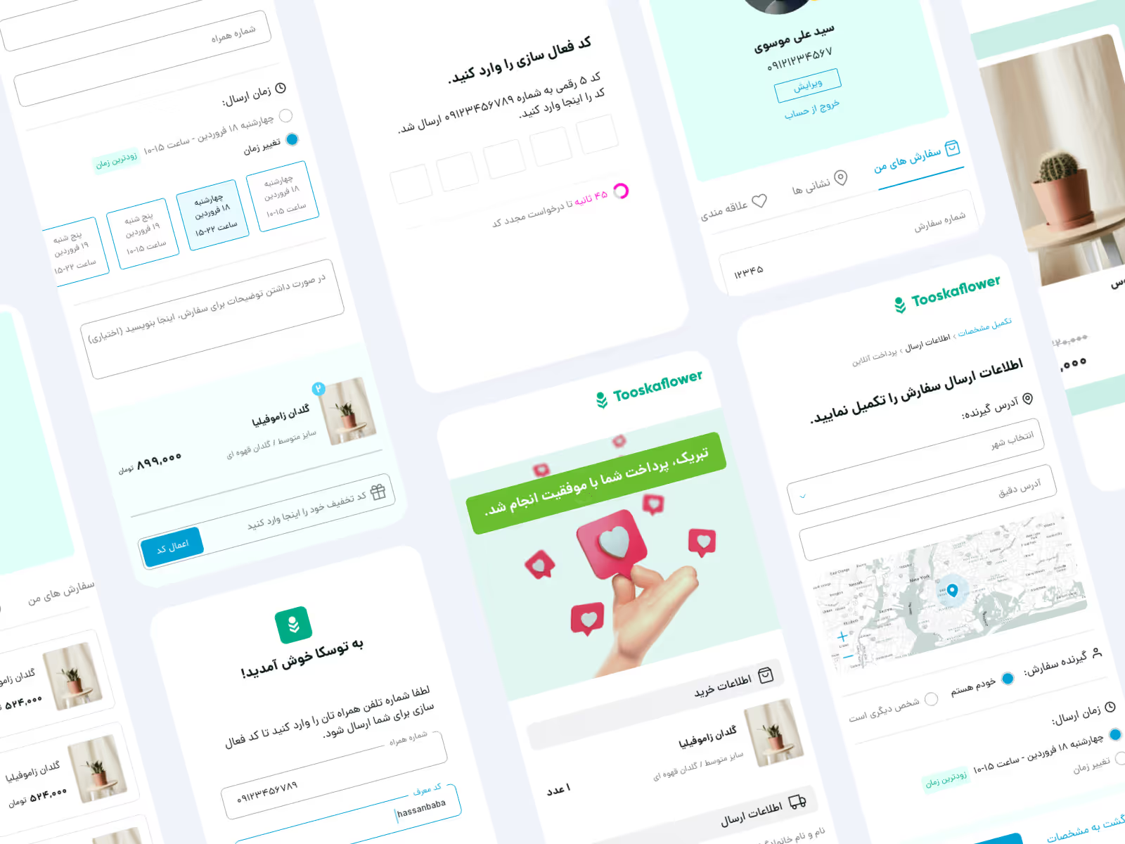
Designing the Shopping Experience
Redesigned Product Pages
I restructured the product pages to:
- Center emotional, large-scale photography
- Provide size options (S/M/L) with visual comparisons
- Add meaningful quick add-ons: vase, note card, ribbon
- Show real delivery estimates (“Arrives today between 3–6 PM”)
- Highlight freshness guarantees
This shifted the product from feeling transactional to feeling thoughtful.
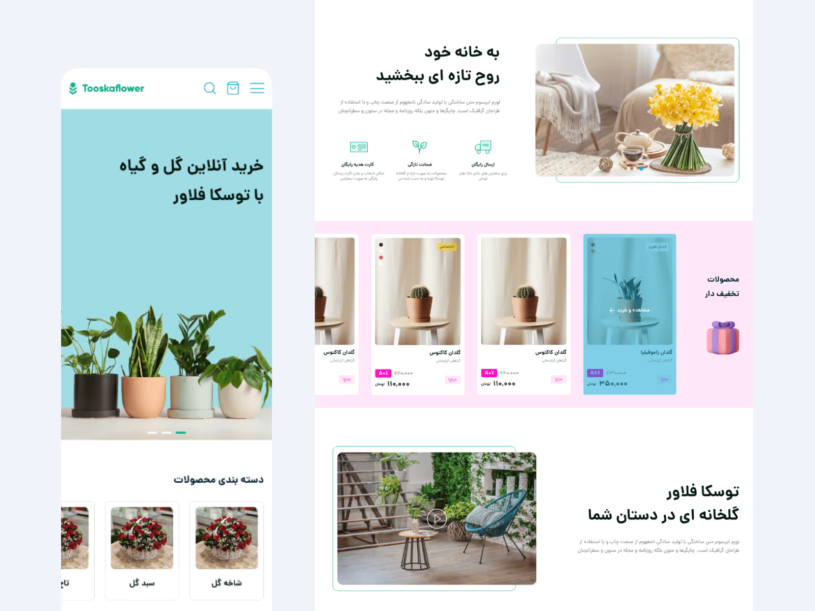
Navigation Built for Real Occasions
Users shop by emotion, not by SKU.
So I introduced:
- “For Birthdays”
- “For Apologies”
- “For Love”
- “Same-Day Delivery”
- “Under 300K”
These categories removed hesitation and guided users instantly.
A Checkout Designed for Zero Friction
The new checkout included:
- Guest checkout (no barriers)
- Saved addresses & repeat delivery slots
- A clean gift-message flow
- Delivery scheduling
- Order preview with exact arrival time
Every screen moved users forward — emotionally and functionally.
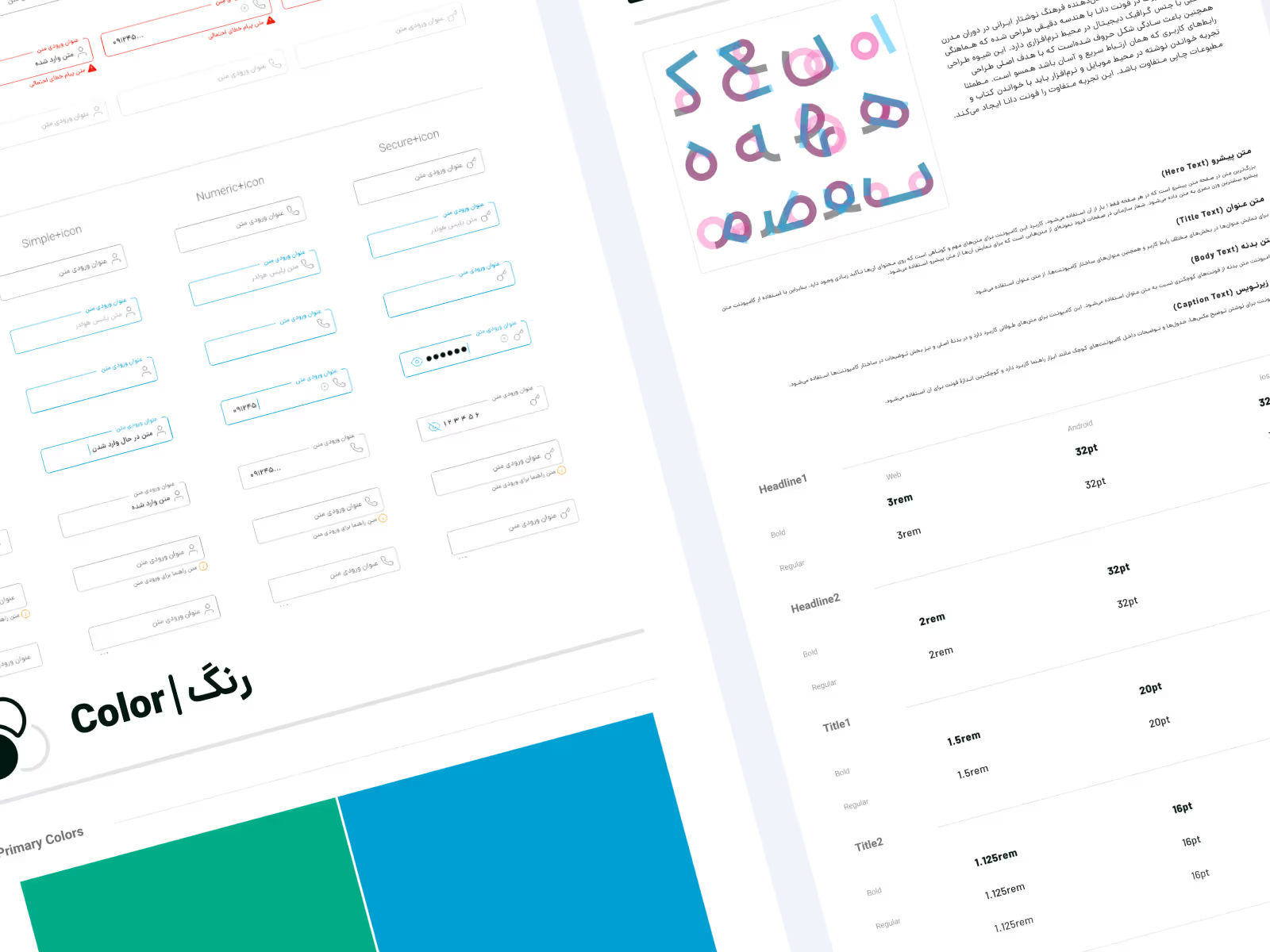
Lightweight Design System
I built a modular design system covering:
- Product cards
- Buttons & primary interactions
- Pricing layouts
- Delivery badges
- State logic & microcopy
This enabled consistency across desktop and mobile.
Testing & Iteration
I tested the prototype with a small group of real customers:
- 5 gift-givers
- 3 last-minute shoppers
- 2 repeat buyers
Results were strong:
- Everyone understood bouquet sizes without explanation
- Delivery clarity reduced hesitation
- Add-on discoverability increased
- Checkout completion time dropped noticeably
Small iterations — button placement, delivery copy, mobile spacing — refined the final flow.
Results — A Buying Experience Worthy of the Flowers
While Tooskaflower didn’t share specific conversion numbers, we observed:
- Fewer support inquiries about delivery timing
- Higher add-on attachment rates
- A noticeable drop in checkout drop-offs
- Faster decision-making from first-time buyers
- Positive feedback regarding simplicity and emotional feel
Customers trusted the brand more because the experience finally matched the quality of the product.
Reflection — Designing for Gifts, Not Products
This project reinforced an important principle:
In eCommerce, especially in gifting, clarity is empathy.
People buy flowers to express something meaningful — love, gratitude, apology, celebration.
Our job wasn’t to sell bouquets; it was to honor that emotional gesture and remove any friction that could break the moment.
Tooskaflower now had a digital experience that radiated the same care as their arrangements — and made sending flowers feel effortless.