

As a Product Designer, I’ve always believed in the power of focus.
Early on, our B2B MDM solution had a clear lane: Apple devices.
And we were good at it! But in almost every live demo, a common question kept popping up:
“Does your platform support Android devices?”
This wasn’t just a casual query — it was a signal from our customers, especially those in industries like retail with diverse mobile fleets.
Suddenly, Android wasn’t just on the roadmap; it was a top priority.

The Android Imperative
Due to our lean team and my dual background in design and product management, I was asked to take the lead.
It felt like wearing multiple hats — product manager, researcher, designer, and even detective.
But that’s exactly where great design begins.
My first and most crucial step — something I emphasize to every designer — was to understand the challenge before designing a single screen.
Rushing into UI without clarity leads to confusion and wasted effort.
So, I started by validating the why.
At first, it seemed reasonable to stay focused on Apple and Windows like many competitors.
But when I revisited our mission — to be a cross-platform management solution — it became clear that Android wasn’t optional.
Our target industries, especially retail and logistics, had heavy Android adoption, both under Corporate-Owned (COD)and BYOD programs.
In some cases, over half the BYOD devices were Android.
If we were serious about empowering IT admins with full visibility and control, Android support was essential.
Understanding the “How”
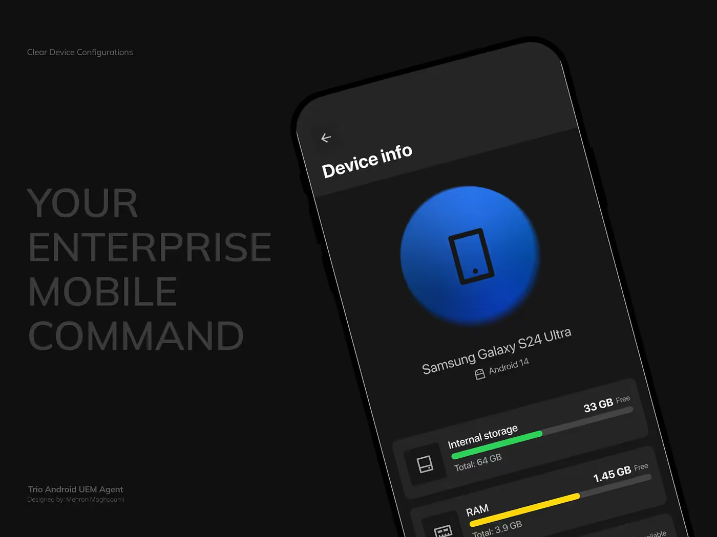
Android management isn’t simple. It involves multiple enrollment paths — from standard RMM (agent-only) setups to Android Enterprise (fully managed EMM) — plus pairing and provisioning complexities.
To avoid designing blind, I performed competitive UX analysis on platforms like Hexnode and Scalefusion, identifying not just what they did, but where users struggled.
My goal wasn’t to mimic, but to design something simpler, clearer, and more cohesive.
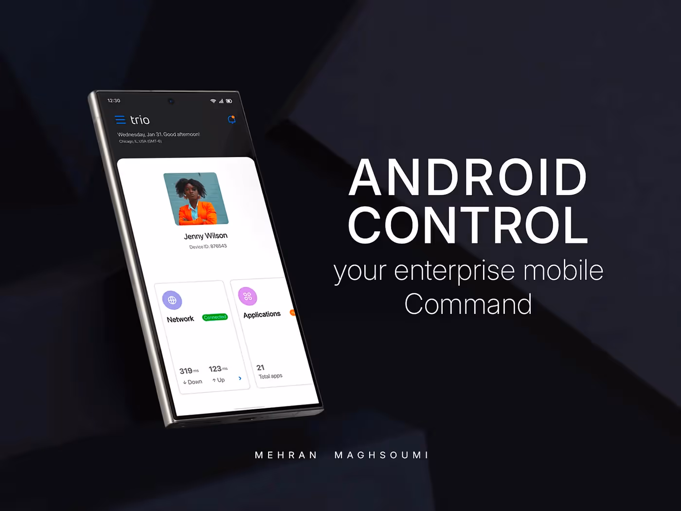
Designing for Simplicity and Control
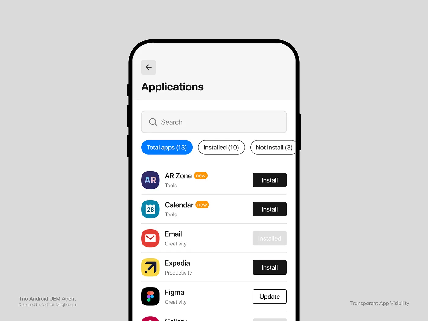
After weeks of research and prototyping, we built an Android Agent App that merged both RMM and EMMcapabilities under one elegant experience.
The design approach was guided by three principles:
- Make complex flows feel invisible.
- Empower users with transparency.
- Keep admins in control without adding friction.
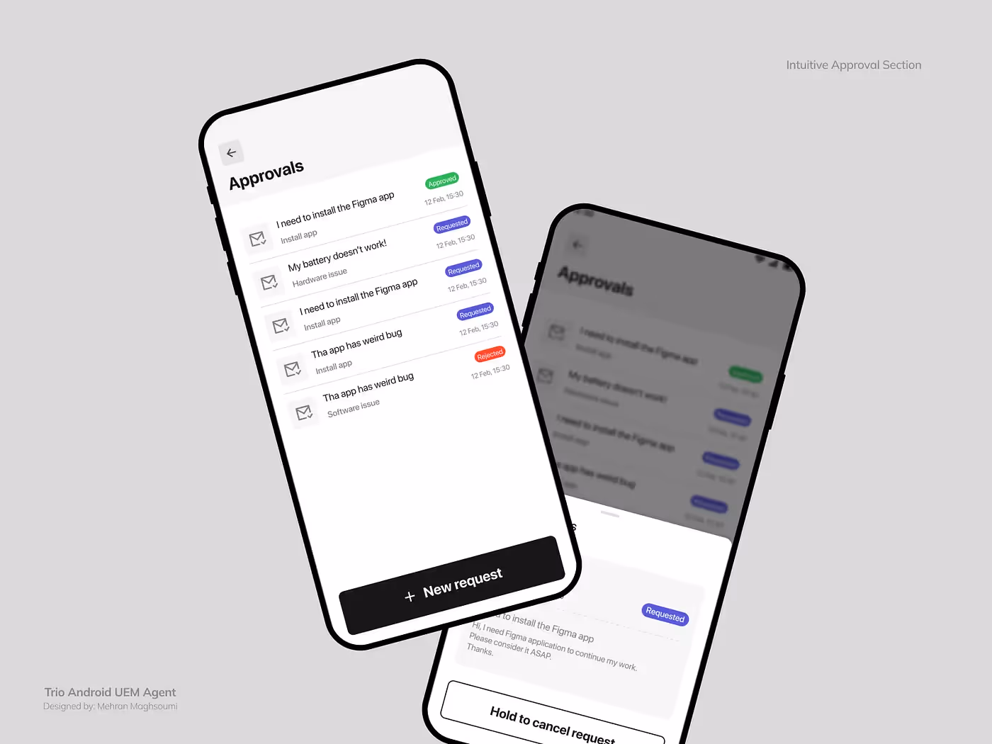
Built-In Support That Empowers Users
We didn’t stop at management.
Recognizing that end-users might need help, we added a Help & Request section inside the app — allowing direct communication with IT admins.
No tickets, no waiting — just built-in, proactive support.
Many of these small but meaningful touches — like transparent approvals and unified RMM/EMM control — made our app stand out from competitors that often forced users through disjointed or opaque experiences.
Measurable Results
Since releasing the Android app:
- We successfully expanded into new industries previously unable to use our platform.
- Several companies began testing our product specifically because of Android support.
- The app became a core part of our sales demos, helping close deals with BYOD-heavy teams.
- Internally, it became proof that our design vision worked — even under constraints.
Final Thoughts
This project wasn’t just about Android — it was about commitment to experience.
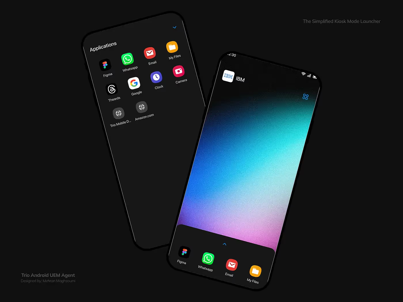
From EMM enrollment to kiosk scenarios, we built something that feels less like another IT tool and more like an invisible partner for both admins and employees.
Good design isn’t always what’s visible — it’s what feels effortless.
Read the Full Story
For the complete behind-the-scenes breakdown and UX lessons: