

You know that feeling when you log into a B2B product, and the dashboard is just… there?
A jumble of data, a few interesting charts, but nothing that really guides you?
Yeah, I’ve been there too.
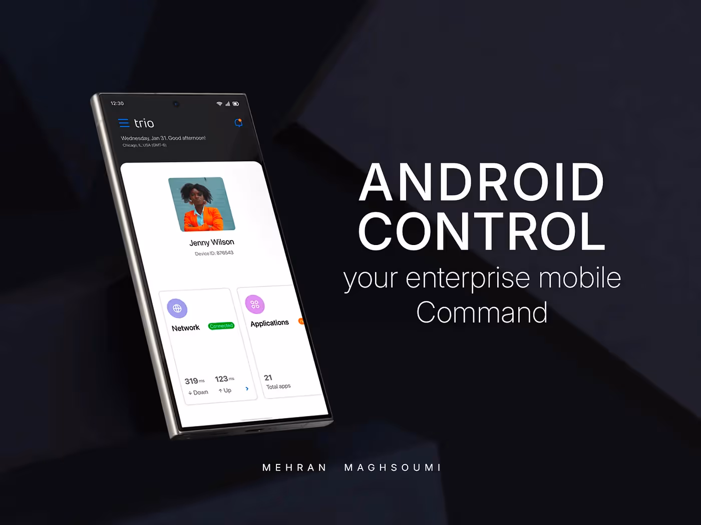
As a Product Designer, one of my biggest challenges was taking a complex cybersecurity and MDM solution and transforming its dashboard from a static display into a powerful, personalized command center for busy IT admins.
The Dashboard Dilemma: When “Good Enough” Isn’t Enough
In B2B and enterprise software, dashboards are supposed to be your superpower — a real-time pulse of your product.But our original dashboard fell short. It had some insights, sure, but it wasn’t comprehensive enough for the diverse needs of our users.
The issue wasn’t just visual; it was scaling.
As our platform expanded across industries with different workflows, edge cases, and feature sets, maintaining multiple dashboard versions became unsustainable.
We needed a smarter approach — one that could flex and grow without breaking every release.
So, the challenge became:
“How do you design for dozens of entities, hundreds of requirements, and vastly different industries — all at once?”
My Mission: From Static to Seriously Dynamic
My goal was clear: build a dynamic dashboard that truly adapts to every user.
To start, I analyzed real user behavior, listened to feedback, and studied industry best practices. One insight stood out:
Everyone wanted customization.
Users didn’t just want our insights — they wanted their own, tailored to their specific roles and priorities.
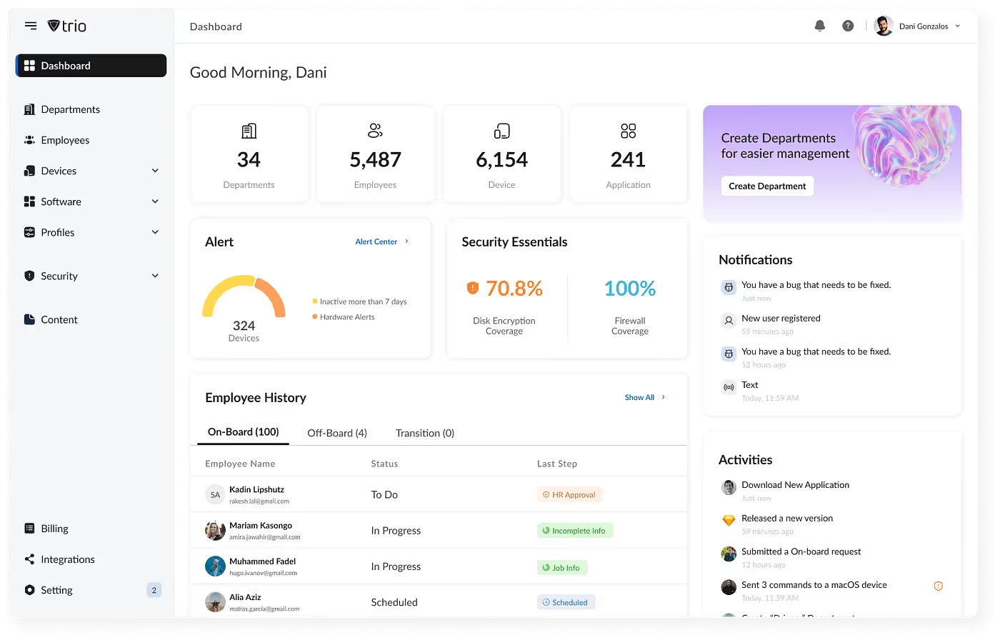
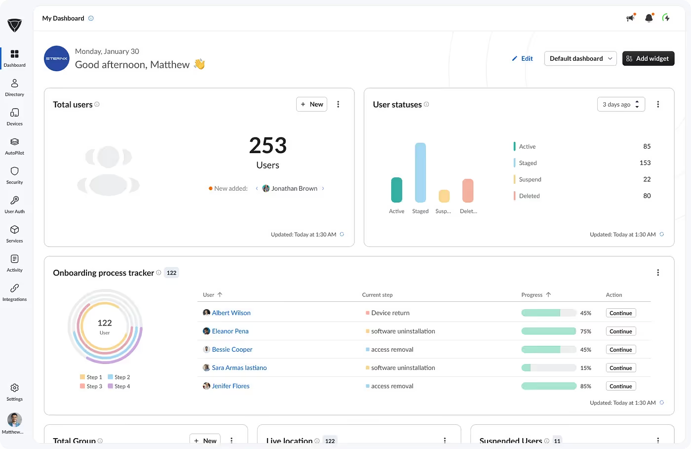
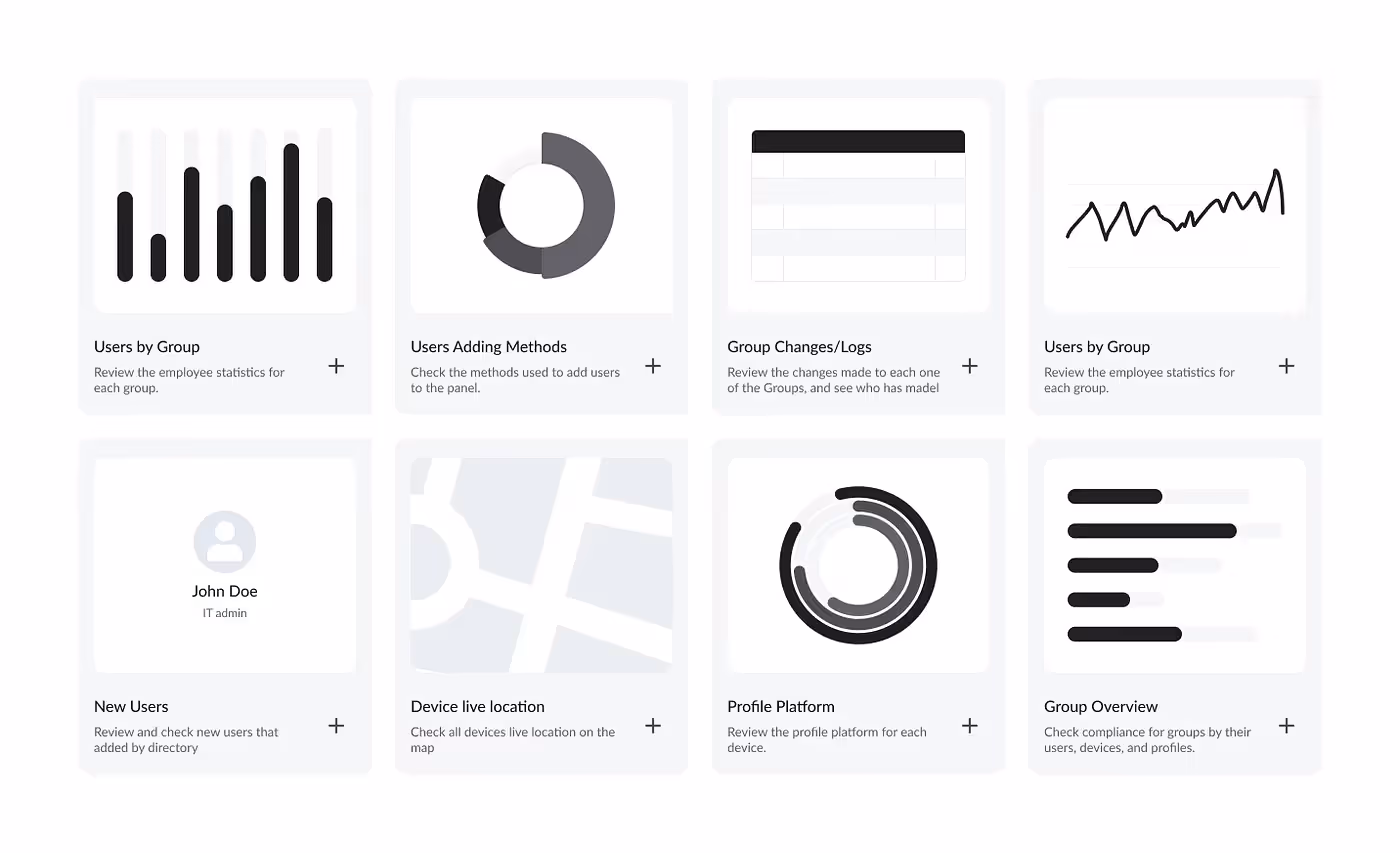
I began by defining a core widget system — each representing a modular data source.
Users could add, remove, or rearrange widgets to build their own dashboard experience.
This worked… until it grew.
With 60+ widgets available, discoverability became a new problem. How do you keep things powerful and simple?
That’s when the “aha!” moment arrived.
The Power of Personalization: Dashboard Templates
In the next release, I introduced Dashboard Templates — a breakthrough in flexibility and focus.
Now users could:
- Create custom dashboards for different goals — e.g., Device Management, User Directory, or SaaS Monitoring.
- Start from predefined templates — curated layouts with essential widgets for quick setup.
This shift transformed the dashboard from a static screen into a living workspace — a control room tailored to each user’s world.
What Made It Unique (and User-Loved!)
Through continuous testing and user feedback, we refined the experience around several core principles:
Tailored Views for Every Role
Users only saw widgets related to the modules they owned — eliminating clutter and irrelevant data.
Intuitive Drag-and-Drop
Users could easily rearrange widgets; the responsive grid adapted perfectly to any screen size.
Actionable Insights with Time Ranges
Each widget included time filters for deeper analysis, letting admins zoom into trends and performance changes.
Diverse Data Visualization
We designed a rich widget library supporting all data types — charts, tables, cards, graphs — ensuring data was always meaningful and easy to read.
The Result: More Than Just Metrics
The impact was immediate — and measurable.
After three months of rollout:
- Dashboard interaction increased by 32% (based on Clarity analytics).
- Users built custom dashboards to match their workflows, improving navigation efficiency.
- IT admins reported faster problem detection and higher productivity thanks to personalized templates.
This wasn’t just a UI redesign — it was a redefinition of engagement, turning a passive data wall into a decision-making powerhouse.
Final Thoughts
Dynamic dashboards aren’t just a design feature; they’re a philosophy.
They empower users to take ownership of their experience — to see what matters most to them, right when they need it.
A good dashboard doesn’t just show data. It shows clarity, control, and confidence.
Read the Full Story
For the complete behind-the-scenes breakdown and UX lessons: